Vue.js实现标签页组件 怎样在Vue.js中实现标签页组件详解
deniro 人气:0前言
标签页组件,即实现选项卡切换,常用于平级内容的收纳与展示。
因为每个标签页的内容是由使用组件的父级控制的,即这部分内容为一个 slot。所以一般的设计方案是,在 slot 中定义多个 div,然后在接到切换消息时,再显示或隐藏相关的 div。这里面就把相关的交互逻辑也编写进来了,我们希望在组件中处理这些交互逻辑,slot 只单纯处理业务逻辑。这可以通过再定义一个 pane 组件来实现,pane 组件嵌在 tabs 组件中。
1 基础版
因为 tabs 组件中的标题是在 pane 组件中定义的,所以在初始化或者动态变化标题时,tabs 组件需要从 pane 组件中获取标题。
html:
<!DOCTYPE html>
<html lang="en">
<head>
<meta charset="UTF-8">
<title>标签页组件</title>
<link rel="stylesheet" type="text/css" href="index.css">
</head>
<body>
<div id="app" v-cloak>
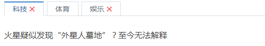
<tabs v-model="activeIndex">
<pane label="科技">
火星疑似发现“外星人墓地”?至今无法解释
</pane>
<pane label="体育">
全美沸腾!湖人队4年1.2亿迎顶级后卫,詹姆斯:有他就能夺冠
</pane>
<pane label="娱乐">
阿米尔汗谈中国武侠 想拍印度版《鹿鼎记》
</pane>
</tabs>
</div>
<script src="https://cdn.bootcss.com/vue/2.2.2/vue.min.js"></script>
<script src="tabs.js"></script>
<script>
var app = new Vue({
el: '#app',
data: {
activeIndex: 0
}
});
</script>
</body>
</html>
pane 组件:
Vue.component('pane', {
 name: 'pane',
 template: '\
 <div class="pane" v-show="isShow">\
 <slot></slot>\
 </div>\
 ',
 props: {
 //标题
 label: {
 type: String,
 default: ''
 }
 },
 data: function () {
 return {
 //显示或隐藏
 isShow: true
 }
 },
 methods: {
 //通知父组件,更新标题
 init() {
 this.$parent.init();
 }
 },
 watch: {
 //当 label 值发生变化时,更新标题
 label() {
 this.init();
 }
 },
 //挂载时,更新标题
 mounted() {
 this.init();
 }
});
在 pane 组件中,我们做了以下设计:
- 因为 pane 组件需要控制标签页内容的显示与隐藏,所以我们在 data 中定义了一个 isShow,并用 v-show 指令来控制内容的显示或隐藏。当点击这个 pane 所对应的标签页标题时,它的 isShow 被设置为 true。
- 我们需要一个标识来识别不同的标签页标题,本示例用的是 pane 组件定义顺序的索引。
- 在 props 中定义了 label,用于存放标题。因为 label 可以动态变化,所以必须在挂载 pane 以及当 label 值发生变化(通过监听实现)时,通知父组件,重新初始化标题。因为 pane 是独立组件,所以这里使用了 this.$parent 来调用父组件 tabs 的初始化方法。
tabs 组件:
Vue.component('tabs', {
 template: '\
 <div class="tabs">\
 <div class="tabs-bar">\
 <!-- 标签页标题-->\
 <div :class="tabClass(item)"\
 v-for="(item, index) in titleList"\
 @click="change(index)">\
 {{ item.label }}\
 </div>\
 </div>\
 <div class="tabs-content">\
 <!-- pane 组件位置-->\
 <slot></slot>\
 </div>\
 </div>',
 props: {
 value: {
 type: [String, Number]
 }
 },
 data: function () {
 return {
 currentIndex: this.value,
 titleList: []//存放标题
 }
 },
 methods: {
 //设置样式
 tabClass: function (item) {
 return ['tabs-tab', {
 //为当前选中的 tab 添加选中样式
 'tabs-tab-active': (item.name === this.currentIndex)
 }]

 },
 //获取定义的所有 pane 组件
 getTabs() {
 return this.$children.filter(function (item) {
 return item.$options.name === 'pane';
 })
 },
 //更新 pane 是否显示状态
 updateIsShowStatus() {
 var tabs = this.getTabs();
 var that = this;
 //迭代判断并设置某个标签页是显示还是隐藏状态
 tabs.forEach(function (tab, index) {
 return tab.isShow = (index === that.currentIndex);
 })
 },
 //初始化
 init() {
 /**
 * 初始化标题数组
 */
 this.titleList = [];
 var that = this;//设置 this 引用
 this.getTabs().forEach(function (tab, index) {
 that.titleList.push({
  label: tab.label,
  name: index
 });

 //初始化默认选中的 tab 索引
 if (index === 0) {
  if (!that.currentIndex) {
  that.currentIndex = index;
  }
 }
 });

 this.updateIsShowStatus();
 },
 //点击 tab 标题时,更新 value 值为相应的索引值
 change: function (index) {
 var nav = this.titleList[index];
 var name = nav.name;
 this.$emit('input', name);
 }
 },
 watch: {
 //当 value 值发生改变时,更新 currentIndex
 value: function (val) {
 this.currentIndex = val;
 },
 //当 currentIndex 值发生改变时,更新 pane 是否显示状态
 currentIndex: function () {
 this.updateIsShowStatus();
 }
 }
});
- getTabs() 中通过 this.$children 来获取定义的所有 pane 组件。因为很多地方都会用到getTabs() ,所以这里把它单独定义出来。
- 注意: methods 中如果存在回调函数,那么需要在外层事先定义一个 var that = this;,在 that 中引用 Vue 实例本身,也可以使用 ES2015 的箭头函数。
- 在初始化方法中,我们通过迭代 pane 组件,初始化了标题数组,label 取定义的标题,name 取所在的索引。 标题数组用于模板定义中。
- updateIsShowStatus() 用于更新 tab 是否显示状态。之所以独立出来,是为了在监听 currentIndex 发生变化时,也能调用该方法。
- 在模板定义中,我们使用 v-for 指令渲染出标题,并绑定了 tabClass 函数,从而实现了动态设置样式。因为需要传参,所以不能使用计算属性。
- 点击每一个 tab 标题时,会触发 change(),来更新 value 值为相应的索引值。在 watch 中,我们监听了 value 值,当 value 值发生改变时,更新 currentIndex。也监听了 currentIndex 值,当 currentIndex 值发生改变时,更新 pane 是否显示状态。
总结如下:
- 使用组件嵌套方式,将多个 pane 组件作为 tabs 组件的 slot。
- tabs 组件与 pane 组件,通过父子链(即 $parent 与 $children)实现通信。
样式:
[v-cloak] {
 display: none;
}

.tabs {
 font-size: 14px;
 color: #657180;
}

.tabs-bar:after {
 content: '';
 display: block;
 width: 100%;
 height: 1px;
 background: #d7dde4;
 margin-top: -1px;
}

.tabs-tab {
 display: inline-block;
 padding: 4px 16px;
 margin-right: 6px;
 background: #fff;
 border: 1px solid #d7dde4;
 cursor: pointer;
 position: relative;
}

.tabs-tab:hover {
 color: #336699;
 font-weight: bolder;
}

.tabs-tab-active {
 color: #336699;
 border-top: 1px solid #336699;
 border-bottom: 1px solid #fff;
}

.tabs-tab-active:before {
 content: '';
 display: block;
 height: 1px;
 background: #3399ff;
 position: absolute;
 top: 0;
 left: 0;
 right: 0;
}

.tabs_content {
 padding: 8px 0;
}

.pane {
 margin-top: 26px;
 font-size: 16px;
 line-height: 24px;
 color: #333;
 text-align: justify;
}
效果:

2 关闭属性
我们为 pane 组件新增一个 closable 属性,用于控制该标签是否可关闭。
在子窗口组件的 props 中,新增 closable 属性:
props: {
	...
	//是否可关闭
	closable: {
		type: Boolean,
		default: false
	}
}
在标签页组件中的模板中,新增关闭标签:
...
template: '\
<div class="tabs">\
	<div class="tabs-bar">\
		<!-- 标签页标题-->\
		<div :class="tabClass(item)"\
			v-for="(item, index) in titleList"\
			@click="change(index)">\
			{{ item.label }}\
			<span v-if="item.closable" class="close" @click="close(index,item.name)"></span>\
			</div>\
		</div>\
		<div class="tabs-content">\
		 <!-- pane 组件位置-->\
			<slot></slot>\
		</div>\
	 </div>',
...
- 这里使用 v-if 指令,根据 closable 的值来判断是否构建 “关闭” 标签。
- 点击事件绑定了 close() 函数,传入标签所在索引以及标签的名称。
在标签页组件中的方法中,新增了 close(),用于执行关闭标签页逻辑:
close: function (index, name) {
 //删除对应的标题元素
	this.titleList.splice(index, 1);

	var tabs = this.getTabs();
	var that = this;
	//迭代判断并设置点击的标签页是隐藏状态
	tabs.forEach(function (tab, index) {
		if (index === name) {
			return tab.isShow = false;
		}
	});
}
- 首先在标题数组中删除对应的标题元素,因为 Vue.js 的核心是数据与视图的双向绑定。因此当我们修改数组时, Vue.js 就会检测到数组发生了变化,所以用 v-for 渲染的视图也会同步更新 。
- 接着,隐藏对应的 tab 内容,我们通过传入的 name 与某个 tab 中的 index,逐一比对,如果确定是我们需要关闭的标签页,那么就隐藏其内容。其实这里使用 key 来表达更合适。
新增的样式:
.close{
 color: #FF6666;
}
.close::before {
 content: "\2716";
}

.close:hover {
 color: #990033;
 font-weight: bolder;
}
为需要添加关闭标签的 pane ,添加 closable 属性:
<div id="app" v-cloak>
 <tabs v-model="activeIndex">
 <pane label="科技" closable="true">
 火星疑似发现“外星人墓地”?至今无法解释
 </pane>
 <pane label="体育">
 全美沸腾!湖人队4年1.2亿迎顶级后卫,詹姆斯:有他就能夺冠
 </pane>
 <pane label="娱乐" closable="true">
 阿米尔汗谈中国武侠 想拍印度版《鹿鼎记》
 </pane>
 </tabs>
</div>
效果:
3 切换动画
我们在切换标签页时,加上滑动动画吧,这很简单,只要在激活的样式中加上 transform 与 transition 样式即可:
.tabs-tab-active {
 color: #336699;
 border-top: 1px solid #336699;
 border-bottom: 1px solid #fff;
 transform:translateY(-1px);
 transition: transform 0.5s;
}
效果:

我们让标签页标题被点击时,以动画的形式往上移动 1 个像素。是不是很酷呀O(∩_∩)O~
总结
以上就是这篇文章的全部内容了,希望本文的内容对大家的学习或者工作具有一定的参考学习价值,如果有疑问大家可以留言交流,谢谢大家对的支持。
加载全部内容