matplotlib给柱状图添数据标签
我这一次 人气:00.更新matplotlib库
本文后续的实验过程都是基于matplotlib版本大于等于3.4.1,如果版本较低,是无法实行后续操作的,如何在Pycharm中直接更新matplotlib库的版本,请参照方法:以tensorflow库为例用Pycharm更新第三方库
1.导入库
直接导入matplotlib.pyplot库,代码为:
import matplotlib.pyplot as plt
2.数据准备
用list分别准备横坐标和纵坐标的数据。
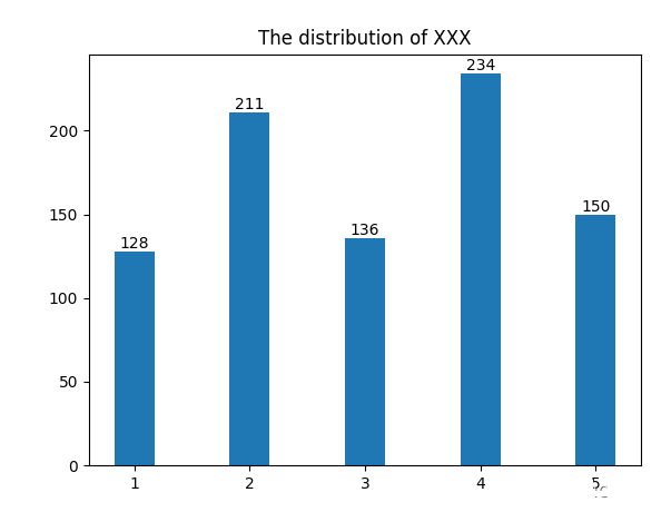
# 构造数据
X_set = [1, 2, 3, 4, 5]  # X轴数值
Y_set = [128, 211, 136, 234, 150]  # Y轴数据
3.绘制柱状图
绘图代码如下:
p1 = plt.bar(X_set, Y_set, width= 0.35, label='value')  # width表示柱子的宽度
plt.bar_label(p1, label_type='edge')   # label_type=‘edge'表示将数据值标签放在柱子顶端,label_type=‘center'表示将数据值标签放在柱子中间。
plt.title('The distribution of XXX')
plt.show()
4.绘图结果
上述绘图结果如下:
5.完整代码
完整代码如下:
import matplotlib.pyplot as plt

# 构造数据
X_set = [1, 2, 3, 4, 5]
Y_set = [128, 211, 136, 234, 150]
p1 = plt.bar(X_set, Y_set, width= 0.35, label='value')
plt.bar_label(p1, label_type='edge')
plt.title('The distribution of XXX')
plt.show()
6.bar_label()相关参数的补充说明
函数的签名为matplotlib.pyplot.bar_label(container, labels=None, *, fmt='%g', label_type='edge', padding=0, **kwargs)。
函数的参数为:
- (1)container:柱子的容器对象,通常为bar或barh函数返回值。 .BarContainer对象。必备参数。
- (2)labels : 标签文本列表。类数组对象。可选参数。如果为None,则值为使用fmt参数格式化的柱子的数据(柱子的高度)。
- (3)fmt:标签的格式字符串。 字符串。默认值为’%g’,即将标签值格式化为浮点数。
- (4)label_type :标签类型。取值范围为 {'edge', 'center'},默认值为'edge'。对于普通柱状图,该参数仅用于控制标签的位置,对于堆积柱状图,不同标签类型对应不同的标签值。
- (4.1)
'edge': 标签位于柱子的端点。显示的值为柱子的端点位置。注意!对于堆积柱状图即堆积的多个柱子的总长度。 - (4.2)
'center':标签位于柱子的中部。显示的值为柱子的长度。
- (4.1)
- (5)padding : 标签与柱子之间的距离,单位为像素。浮点数。默认值为0。
- (6)**kwargs:传递给
annotate()的其他参数。返回值为标签的Text对象列表。
加载全部内容