Vue Echarts柱状折线图
天使的同类 人气:0vue处理json数据渲染柱状折线图
HTML:
<div id="lineCharts" style="width: 100%; height: 500px; margin-top: 20px"></div>
JS:
drawLineCharts() {
let data = {sid: "02fertdfg0221",choose: 1,}; //这里是接口的传参
axios
.request({
url: url, //接口地址
method: "POST",
data: JSON.stringify(data),
})
.then((res) => {
let dateData = []; //日期
let rankingData = []; //排行
let commentsData = []; //销量
let outdata = JSON.stringify(res.result); //数据
let xqo = eval("(" + outdata + ")"); //转换类型
for (var i in xqo) { //分别获取日期 排行 和 销量的数组值
dateData.push(xqo[i].create_time.substring(0, 10));
commentsData.push(xqo[i].comments_value);
rankingData.push(xqo[i].ranking);
}
this.chartPie = echarts.init(document.getElementById("lineCharts")); //表格id
this.chartPie.setOption({
title: {
text: "",
},
tooltip: {
trigger: "axis",
axisPointer: {
// 坐标轴指示器,坐标轴触发有效
type: "shadow", // 默认为直线,可选为:'line' | 'shadow'
},
},
legend: {
orient: "horizontal",
data: ["热度", "销量"],
},
grid: {
x: 46,
y: 35,
x2: 37,
y2: 40,
borderWidth: 0,
},
calculable: true,
xAxis: [
{
type: "category",
data: dateData,
splitLine: {
show: false,
},
axisLabel: {
show: true,
margin: 20,
textStyle: {
color: "#a4a7ab",
align: "center",
},
},
},
],
yAxis: [
{
name: "销量趋势",
type: "value",
splitLine: {
show: false,
},
axisLabel: {
show: true,
textStyle: {
color: "#a4a7ab",
},
},
// min: 100,
},
{
name: "热度排名",
type: "value",
position: "right",
splitLine: {
show: false,
},
axisLabel: {
show: true,
formatter: "{value}",
textStyle: {
color: "#a4a7ab",
},
},
},
],
series: [
{
name: "热度",
type: "bar",
barWidth: "20",
data: rankingData,
itemStyle: {
normal: {
barBorderRadius: 5,
color: "#36A1DB",
},
},
},
{
name: "销量",
type: "line",
// smooth: true,
showAllSymbol: true,
symbol: "emptyCircle",
symbolSize: 5,
yAxisIndex: 1,
data: commentsData,
itemStyle: {
normal: {
color: "#EEAB56",
},
},
},
],
});
});
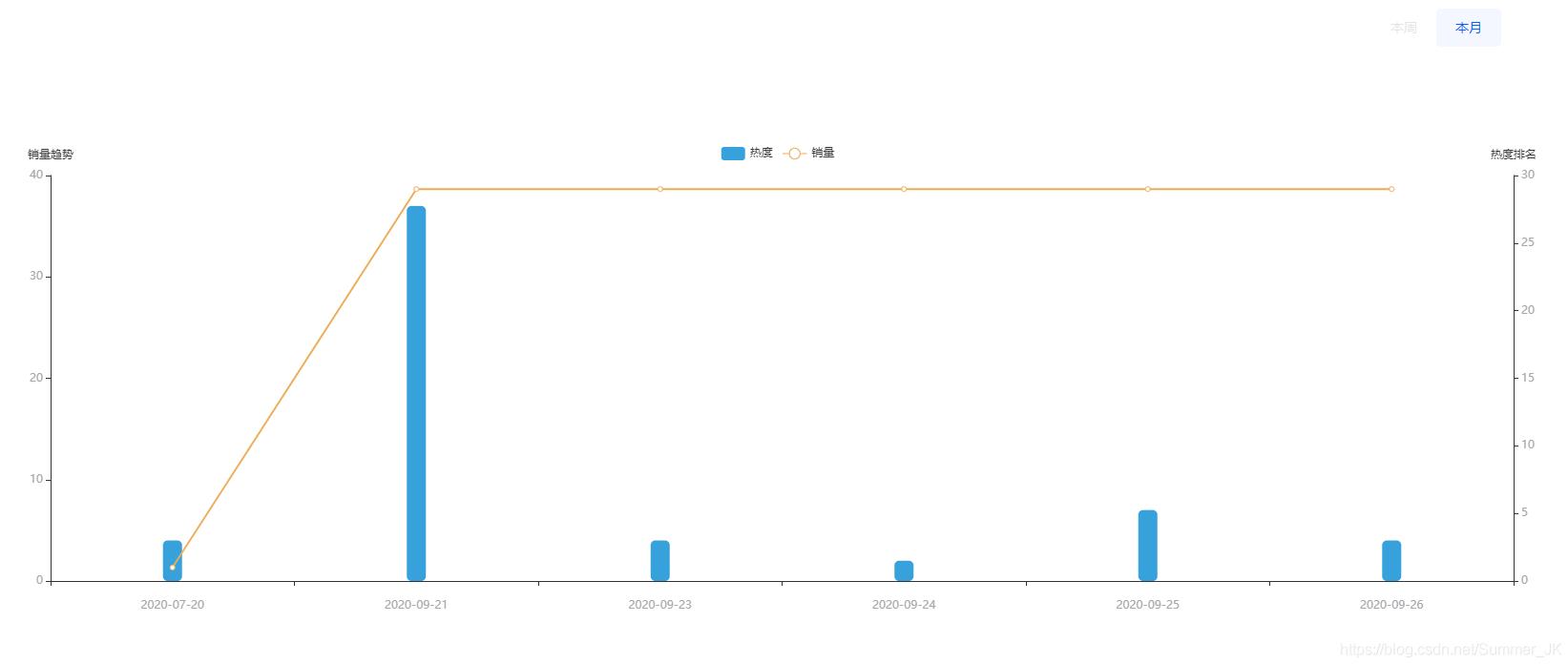
},最后就是效果图:
加载全部内容