利用Matplotlib实现单画布绘制多个子图
杨哥学编程 人气:0Matplotlib实现单画布绘制多个子图
最近研究Python数据分析,需要利用Matplotlib绘制图表,并将多个图表绘制在一张图中,经过一番折腾,利用matplotlib包下的subplot()函数即可实现此功能。
代码实现:
import matplotlib.pyplot as plt
import numpy as np

class Graph(object):
    def __init__(self):
        self.font = {
            'size': 13
        }

    plt.figure(figsize=(9, 6))
    plt.subplots_adjust(wspace=0.7, hspace=0.5)
    plt.rcParams['font.family'] = 'simhei'
    plt.rcParams['axes.unicode_minus'] = False

    def twinx(self):
        a1 = plt.subplot(231)
        plt.title('双纵轴折线图', fontdict=self.font)
        a1.plot(subjects, v1, label='v1')
        a1.set_ylabel('v1')
        a1.legend(loc='upper right', bbox_to_anchor=[-0.5, 0, 0.5, 1], fontsize=7)
        a2 = a1.twinx()
        a2.plot(subjects, v2, 'r--', label='v2')
        a2.set_ylabel('v2')
        a2.legend(loc='upper left', bbox_to_anchor=[1, 0, 0.5, 1], fontsize=7)

    def scatter(self):
        plt.subplot(232)
        plt.title('散点图', fontdict=self.font)
        x = range(50)
        y_jiangsu = [np.random.uniform(15, 25) for i in x]
        y_beijing = [np.random.uniform(5, 18) for i in x]
        plt.scatter(x, y_beijing, label='v1')
        plt.scatter(x, y_jiangsu, label='v2')
        plt.legend(loc='upper left', bbox_to_anchor=[1, 0, 0.5, 1], fontsize=7)

    def hist(self):
        plt.subplot(233)
        plt.title('直方图', fontdict=self.font)
        x = np.random.normal(size=100)
        plt.hist(x, bins=30)

    def bar_dj(self):
        plt.subplot(234)
        plt.title('堆积柱状图', fontdict=self.font)
        plt.bar(np.arange(len(v1)), v1, width=0.6, label='v1')
        for x, y in enumerate(v1):
            plt.text(x, y, y, va='top', ha='center')
        plt.bar(np.arange(len(v2)), v2, width=0.6, bottom=v1, label='v2')
        for x, y in enumerate(v2):
            plt.text(x, y + 60, y, va='bottom', ha='center')
        plt.ylim(0, 200)
        plt.legend(loc='upper left', bbox_to_anchor=[1, 0, 0.5, 1], fontsize=7)
        plt.xticks(np.arange(len(v1)), subjects)

    def bar_bl(self):
        plt.subplot(235)
        plt.title('并列柱状图', fontdict=self.font)
        plt.bar(np.arange(len(v1)), v1, width=0.4, color='tomato', label='v1')
        for x, y in enumerate(v1):
            plt.text(x - 0.2, y, y)
        plt.bar(np.arange(len(v2)) + 0.4, v2, width=0.4, color='steelblue', label='v2')
        for x, y in enumerate(v2):
            plt.text(x + 0.2, y, y)
        plt.ylim(0, 110)
        plt.xticks(np.arange(len(v1)), subjects)
        plt.legend(loc='upper left', bbox_to_anchor=[1, 0, 0.5, 1], fontsize=7)

    def barh(self):
        plt.subplot(236)
        plt.title('水平柱状图', fontdict=self.font)
        plt.barh(np.arange(len(v1)), v1, height=0.4, label='v1')
        plt.barh(np.arange(len(v2)) + 0.4, v2, height=0.4, label='v2')
        plt.legend(loc='upper left', bbox_to_anchor=[1, 0, 0.5, 1], fontsize=7)
        plt.yticks(np.arange(len(v1)), subjects)


def main():
    g = Graph()
    g.twinx()
    g.scatter()
    g.hist()
    g.bar_dj()
    g.bar_bl()
    g.barh()
    plt.savefig('坐标轴类.png')
    plt.show()


if __name__ == '__main__':
    subjects = ['语文', '数学', '英语', '物理', '化学']
    v1 = [77, 92, 83, 74, 90]
    v2 = [63, 88, 99, 69, 66]
    main()
效果如下:
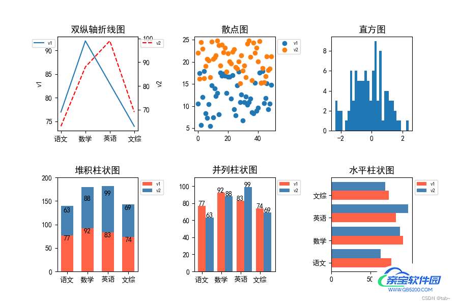
可以看到,一个画板上放了6个子图。达到了我们想要的效果。
现在来解析刚刚的部分代码:
plt.figure(1):表示取第一块画板,一个画板就是一张图,如果你有多个画板,那么最后就会弹出多张图。plt.subplot(231):221表示将画板划分为2行3列,然后取第1个区域。那么第几个区域是怎么界定的呢?这个规则遵循行优先数数规则.优先从行开始数,从左到右按顺序1234……然后再下一行。
Matplotlib绘制多个动态子图
import os
import cv2
import pytz
import numpy as np
from tqdm import tqdm
import matplotlib.pyplot as plt
from matplotlib import animation
from matplotlib.gridspec import GridSpec
from datetime import datetime
# (200,125) ,(300,185)
def ave_area(arrays, left_top=(350, 180), right_lower=(400,255)):
    np_array = arrays[left_top[0]:right_lower[0], left_top[1]:right_lower[1]].reshape(1, -1)
    delete_0 = np_array[np_array != 0]
    return np.mean(delete_0) / 1000

img_depths_x = []
img_depths_y = []
img_colors = []

dirs = r'Z:\10.1.22.215\2021-09-09-18'
for file in tqdm(os.listdir(dirs)[4000:4400]):
    try:
        img_path = os.path.join(dirs, file)
        data = np.load(img_path, allow_pickle=True)
        depthPix, colorPix = data['depthPix'], data['colorPix']
        #rgbimage = cv2.cvtColor(colorPix, cv2.COLOR_BGR2RGB)
        font = cv2.FONT_HERSHEY_SIMPLEX
        text = file.replace('.npz', '')
        cv2.putText(colorPix, text, (10, 30), font, 0.75, (0, 0, 255), 2)
        cv2.putText(depthPix, text, (10, 30), font, 0.75, (0, 0, 255), 2)
        #cv2.imshow('example', colorPix)
        cv2.waitKey(10)
        indexes = file.replace('.npz', '')
        key = datetime.strptime(indexes, '%Y-%m-%d-%H-%M-%S-%f').astimezone(pytz.timezone('Asia/ShangHai')).timestamp()  #格式时间转换
        img_depths_x.append(key)
        img_depths_y.append(ave_area(depthPix))
        img_colors.append(cv2.cvtColor(colorPix,cv2.COLOR_BGR2RGB))

    except:
        continue
fig = plt.figure(dpi=100,
                 constrained_layout=True,  # 类似于tight_layout,使得各子图之间的距离自动调整【类似excel中行宽根据内容自适应】
                 figsize=(15, 12)
                 )
gs = GridSpec(3, 1, figure=fig)#GridSpec将fiure分为3行3列,每行三个axes,gs为一个matplotlib.gridspec.GridSpec对象,可灵活的切片figure
ax1 = fig.add_subplot(gs[0:2, 0])
ax2 = fig.add_subplot(gs[2:3, 0])
xdata, ydata = [], []

rect = plt.Rectangle((350, 180), 75, 50, fill=False, edgecolor = 'red',linewidth=1)
ax1.add_patch(rect)
ln1 = ax1.imshow(img_colors[0])
ln2, = ax2.plot([], [], lw=2)
def init():
    ax2.set_xlim(img_depths_x[0], img_depths_x[-1])
    ax2.set_ylim(12, 14.5)
    return ln1, ln2

def update(n):
    ln1.set_array(img_colors[n])

    xdata.append(img_depths_x[n])
    ydata.append(img_depths_y[n])
    ln2.set_data(xdata, ydata)
    return ln1, ln2

ani = animation.FuncAnimation(fig,
                              update,
                              frames=range(len(img_depths_x)),
                              init_func=init,
                              blit=True)
ani.save('vis.gif', writer='imagemagick', fps=10)
总结
以上为个人经验,希望能给大家一个参考,也希望大家多多支持。
加载全部内容