vue echarts绘制支持切换的折线图
不染-9732 人气:0vue+echarts绘制一个支持切换的折线图
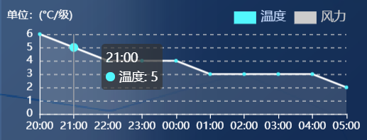
在项目中做了一个基础的折线图效果,样式如下
接下来主要记录在项目中echarts的使用流程
主要关注《xxx》中的内容,其余部分依项目不同而变化
- 折线图如何添加阴影
- 折线图如何进行线段切换
- 折线图如何进行动态数据绑定
- 折线能够从0开始显示,两端不留空白
- echarts在项目中的使用流程
    // 页面初始天气数据的获取
    getWeatherNew(eeiId) {
      var option = {};
      let _this = this;
《==注意内外数据的this指向问题  下面有四个变量this指向作用域外,需要提前记录外部this==》
      api.getWeatherNew(eeiId).then((res) => {
        this.weatherData = res.data.hourlyDTOList;
        // 天气状态加载
        _this.weatherSpan.text = this.weatherData[0].text;
        _this.weatherSpan.temp = this.weatherData[0].temp;
        _this.weatherSpan.windDir = this.weatherData[0].windDir;
        _this.weatherSpan.windScale = this.weatherData[0].windScale;
        option = {
          legend: {
            icon: "rect",
            data: ["温度", "风力"],
《==这里data对应下面的series中的name,name不同对应不同的折线效果==》
            textStyle: {
              //文字样式
              color: "#c1dafc",
              fontSize: "14",
            },
            right: "9%",
            top: "14%",
            selectedMode: "single",
          },
          tooltip: {
            trigger: "axis",
          },
          xAxis: {
《==折线能够从0开始显示,两端不留空白==》
            boundaryGap: false,
            axisLine: {
              lineStyle: {
                color: "#fff",
              },
            },
            type: "category",
            splitLine: {
              lineStyle: {
                color: "#29457e",
              },
            },
            axisLabel: {
              interval: 0,
            },
《==这里使用了function的方法进行动态的数据绑定,主要用于提取接口中的前十个数据内容==》
            data: (function () {
              var x = [];
              for (let i = 0; i < 10; i++) {
                // 时间横坐标
                x.push(_this.weatherData[i].fxTime.split("T")[1].slice(0, 5));
              }
              return x;
            })(),
          },
          yAxis: [
            {
              type: "value",
              axisTick: {
                //y轴刻度线
                show: false,
              },
              name: "单位:(°C/级)",
              axisLabel: {
                formatter: "{value}",
              },
              axisLine: {
                lineStyle: {
                  color: "#fff",
                },
              },
              splitLine: {
                lineStyle: {
                  type: "dashed",
                },
              },
            },
          ],
          series: [
            {
              name: "温度",
              type: "line",
              symbol: "circle", //折线点设置为实心点
《==为折线添加阴影并支持透明度==》
              areaStyle: {
                normal: {
                  color: "rgba(255, 255, 255, 0.2)",
                },
              },
              itemStyle: {
                normal: {
                  color: "#4DF9FF", //折线数据点颜色
                  lineStyle: {
                    color: "#fff",
                  },
                },
              },
              data: (function () {
                var x = [];
                for (let i = 0; i < 10; i++) {
                  // 时间横坐标
                  x.push(_this.weatherData[i].temp);
                }
                return x;
              })(),
            },
            {
              name: "风力",
              type: "line",
              symbol: "circle", //折线点设置为实心点
              areaStyle: {
                normal: {
                  color: "rgba(255, 255, 255, 0.2)",==》折线图添加扫过区域的阴影和背景色透明度
                },
              },
              itemStyle: {
                normal: {
                  color: "#4DF9FF", //折线数据点颜色
                  lineStyle: {
                    color: "#fff",
                  },
                },
              },
              data: (function () {
                var x = [];
                for (let i = 0; i < 10; i++) {
                  // 时间横坐标
                  x.push(_this.weatherData[i].windScale.slice(0, 1));
                }
                return x;
              })(),
            },
          ],
        };
        this.option = option;
《==这里是echarts基础的绘制绑定部分,需要注意的是绑定的元素必须要有宽高,否则不显示==》
        // 天气图表的绘制
        let chartWeather = echarts.init(
          document.getElementById("chartWeather")
        );
        chartWeather.setOption(option);
        this.weatherChange();
      });
    },
这里是关于第一次如何在项目中引入echarts的记录
npm install echarts --save 《==下载echarts插件==》
main文件中引入echarts
使用echarts实现折线图问题
前端可视化是一个前端最基本的技能,要想做的好看,还是得借助一下百度家的echarts,那要怎么在Vue中使用echarts?这个官网没有给出实例,实例基本都是在jquery里面使用,引入的例子。
Echarts官网:https://echarts.apache.org/zh/index.html
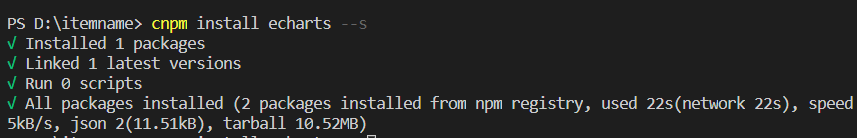
1:在项目里面安装echarts
cnpm install echarts --s
2:在需要用图表的地方引入
import echarts from "echarts";
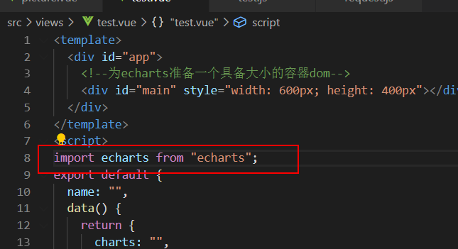
3:打开vue组件,继续写代码,代码如下:
<template>
<div id="app">
<!--为echarts准备一个具备大小的容器dom-->
<div id="main" style="width: 600px; height: 400px"></div>
</div>
</template>
<script>
import echarts from "echarts";
export default {
name: "",
data() {
return {
charts: "",
opinionData: ["3", "2", "4", "4", "5"],
};
},
methods: {
drawLine(id) {
this.charts = echarts.init(document.getElementById(id));
this.charts.setOption({
tooltip: {
trigger: "axis",
},
legend: {
data: ["近七日收益"],
},
grid: {
left: "3%",
right: "4%",
bottom: "3%",
containLabel: true,
},
toolbox: {
feature: {
saveAsImage: {},
},
},
xAxis: {
type: "category",
boundaryGap: false,
data: ["1", "2", "3", "4", "5"],
},
yAxis: {
type: "value",
},
series: [
{
name: "近七日收益",
type: "line",
stack: "总量",
data: this.opinionData,
},
],
});
},
},
//调用
mounted() {
this.$nextTick(function () {
this.drawLine("main");
});
},
};
</script>
<style scoped>
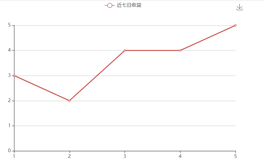
</style>这个时候,可以看到,加载出的折线图了,后面可以继续进行完善。
以上完成的,只是一个静态页面,下面就开始完成动态数据渲染部分的折线图部分啦~~
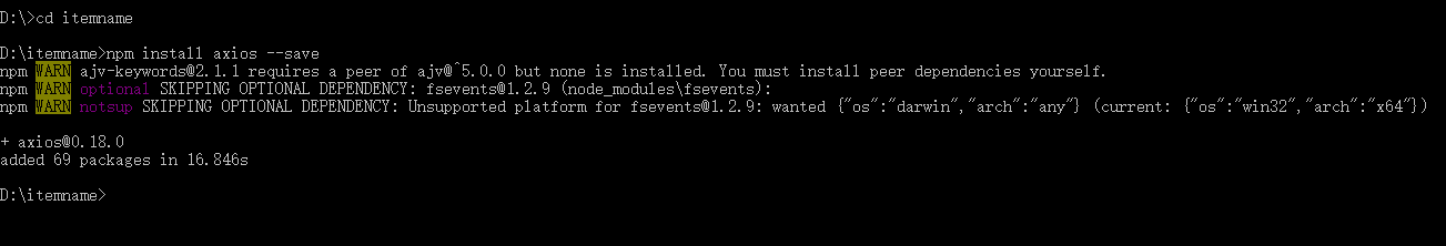
1:进入项目,npm安装
npm install axios --save
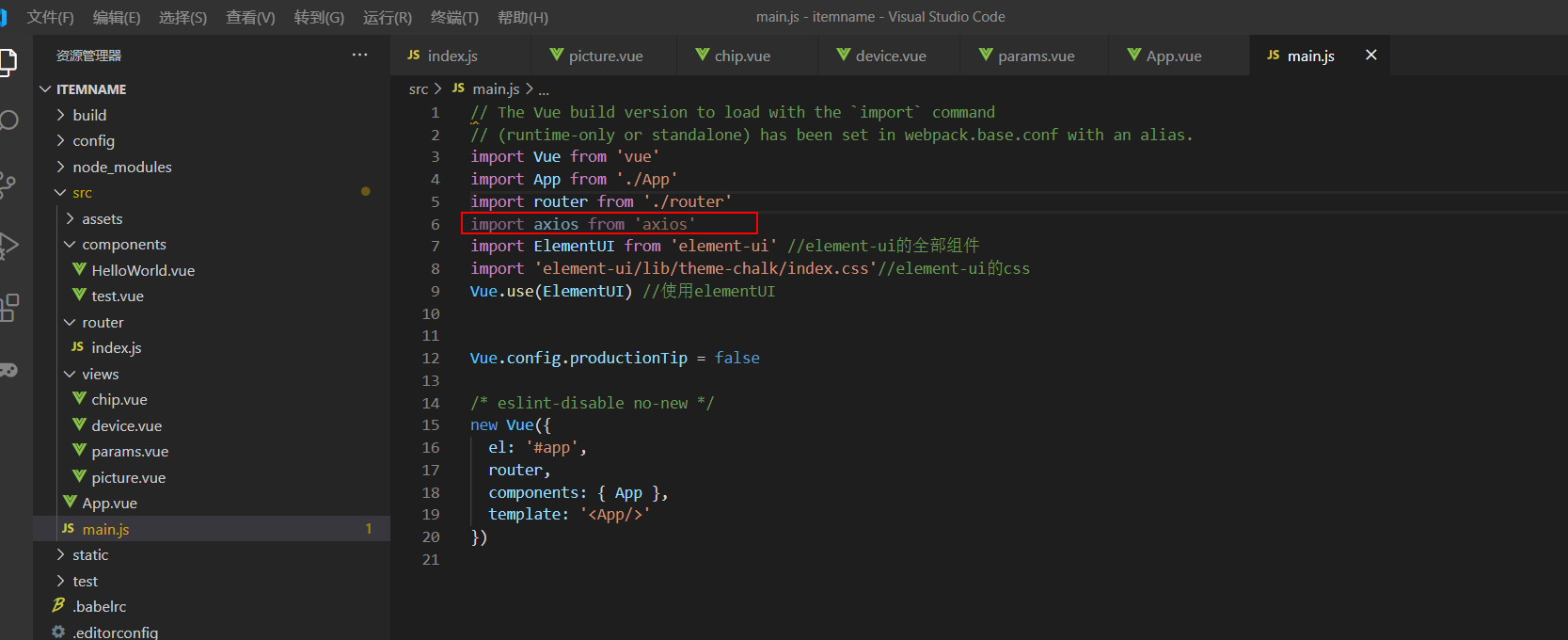
2:在main.js下引用axios
import axios from 'axios'
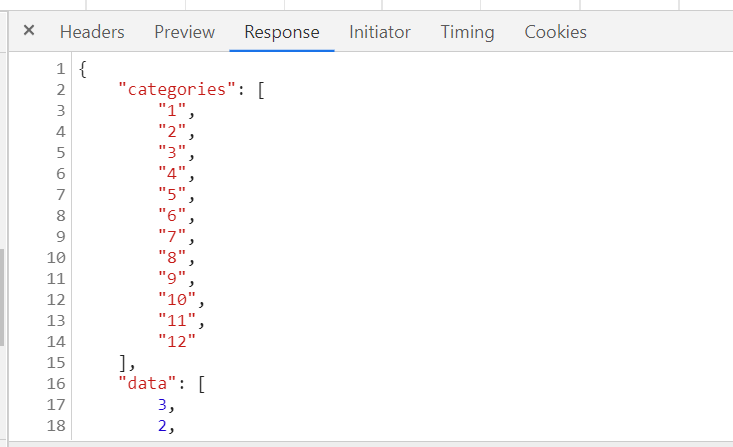
3:准备json数据
{
    "categories": [
        "1",
        "2",
        "3",
        "4",
        "5",
        "6",
        "7",
        "8",
        "9",
        "10",
        "11",
        "12"
    ],
    "data": [
        3,
        2,
        4,
        4,
        5
    ]
}
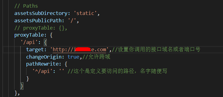
4:跨域问题
一般后端小伙伴给到我们这边的接口里面,应该对跨域问题已经处理好了,所以不需要我们处理了。
如果需要我们处理,我们可以设置代理,利用proxyTable属性实现跨域请求
在config/index.js 里面找到proxyTable :{} ,然后在里面加入以下代码
(这里处于安全考虑,我隐藏了自己的而服务器域名,如果需要测试,改成你自己的即可)
   proxyTable: {
  '/api': {
     target: 'http://inxxxe.com',//设置你调用的接口域名和端口号
    changeOrigin: true,//允许跨域
    pathRewrite: {
      '^/api': '' //这个是定义要访问的路径,名字随便写
    }
  }
},
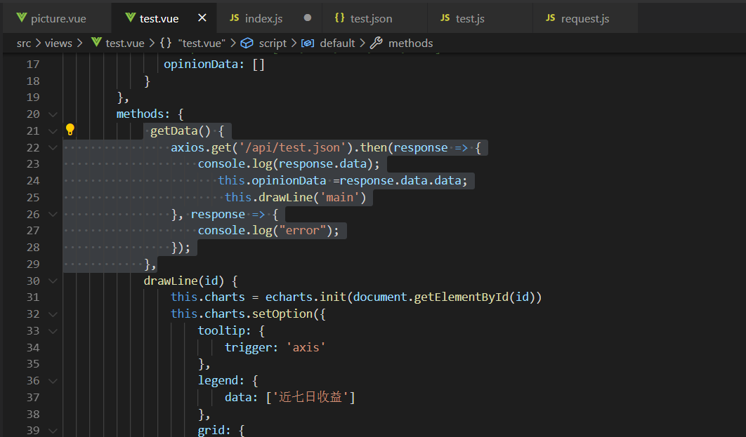
5:打开一个界面test.vue,开始写请求数据的方法
 methods: {
            getData() {
                axios.get('/api/test.json').then(response => {
                    console.log(response.data);
                       this.opinionData =response.data.data;
                        this.drawLine('main')
                }, response => {
                    console.log("error");
                });
            },
        }
6:再次运行
npm run dev
运行成功之后,打开f12,查看network的请求
这个时候,我们可以看见,本地的localhost替代 了我之前放在服务器上的链接的域名,这也是设置代理成功,就解决了跨域的问题了。
请求成功
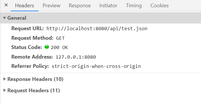
response里面也有返回值,ok,下一步就要开始将这些数据渲染在前端界面上面了。
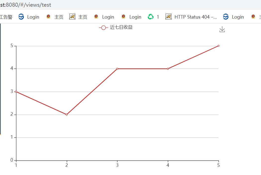
test.vue参考代码:
<template>
    <div>
    <!--为echarts准备一个具备大小的容器dom-->
    <div id="main" style="width: 600px;height: 400px;"></div>
    </div>
</template>
<script>
    import echarts from 'echarts'
      import axios from "axios";
    export default {
        name: '',
        data() {
            return {
                charts: '',

               /* opinionData: ["3", "2", "4", "4", "5"]*/
               opinionData: []
            }
        },
        methods: {
             getData() {
                axios.get('/api/test.json').then(response => {
                    console.log(response.data);
                       this.opinionData =response.data.data;
                        this.drawLine('main')
                }, response => {
                    console.log("error");
                });
            },
            drawLine(id) {
                this.charts = echarts.init(document.getElementById(id))
                this.charts.setOption({
                    tooltip: {
                        trigger: 'axis'
                    },
                    legend: {
                        data: ['近七日收益']
                    },
                    grid: {
                        left: '3%',
                        right: '4%',
                        bottom: '3%',
                        containLabel: true
                    },

                    toolbox: {
                        feature: {
                            saveAsImage: {}
                        }
                    },
                    xAxis: {
                        type: 'category',
                        boundaryGap: false,
                    data: ["1","2","3","4","5"]

                    },
                    yAxis: {
                        type: 'value'
                    },

                    series: [{
                        name: '近七日收益',
                        type: 'line',
                        stack: '总量',
                        data: this.opinionData
                    }]
                })
            },

        },
        //调用
        mounted() {
            this.getData();
        }
    }
</script>
实现效果
以上为个人经验,希望能给大家一个参考,也希望大家多多支持。
加载全部内容